Companies are always trying new things to please their customers, but sometimes those changes are not well received. That was certainly the case when American restaurant chain Cracker Barrel announced earlier this month that it was unveiling a new logo. Disapproving comments from loyal customers and fans quickly flooded the internet, causing the company to return to its old logo. But Cracker Barrel isn’t the only brand that has changed its mind about a design transformation. Keep reading to learn more about others who have gone through logo controversy.
The history of the Cracker Barrel logo
Cracker Barrel was founded in 1969 in Lebanon, Tennessee, by Dan Evins and Tommy Lowe. The iconic logo, however, did not make its first appearance until the ‘70s. Until that point, the restaurant caught the eye of customers with its “‘Cracker Barrel’ Old Country Store’” logo in simple text.
Then in 1977, Nashville designer Bill Holley came up with the new version by sketching on a napkin, according to the company website. Many believe the man leaning on the barrel is Herschel McCartney (uncle of founder Evins) due to his history of serving as the restaurant’s ambassador in town. But Cracker Barrel writes that the man is just an “old-timer wearing overalls” meant to capture nostalgia.
After the logo was first revealed, the only changes made to it involved the font and spacing of the “Cracker Barrel” text, with the classic “old-timer” still heavily featured. That all changed when the company recently announced a revamping of its restaurant interior, menu and logo as part of its “All the More” campaign.
Backlash from loyal customers was quick to follow, and the vocal outrage has led Cracker Barrel to return to its original logo, reports NBC News. On Tuesday, August 26, the company shared the announcement on Facebook.
“We thank our guests for sharing your voices and love for Cracker Barrel. We said we would listen, and we have. Our new logo is going away and our ‘Old Timer’ will remain,” the post reads. “At Cracker Barrel, it’s always been—and always will be—about serving up delicious food, warm welcomes and the kind of country hospitality that feels like family. As a proud American institution, our 70,000 hardworking employees look forward to welcoming you to our table soon.”
It’s assumed that the old logo will quickly return to the chain’s many restaurants, which can be found in 43 states.
Famous logo controversies
Cracker Barrel is not the first (and surely not the last) company to launch a redesign of a logo that did not sit well with customers. Here’s a look at some of the other more controversial changes that prompted a lot of backlash and led to a return of a classic design.
Tropicana

Fruit-based beverage company Tropicana has been around since 1947. It really took off when founder Anthony T. Rossi discovered a way to pasteurize and freeze concentrated juice, which allowed the products to reach a larger market outside of Florida.
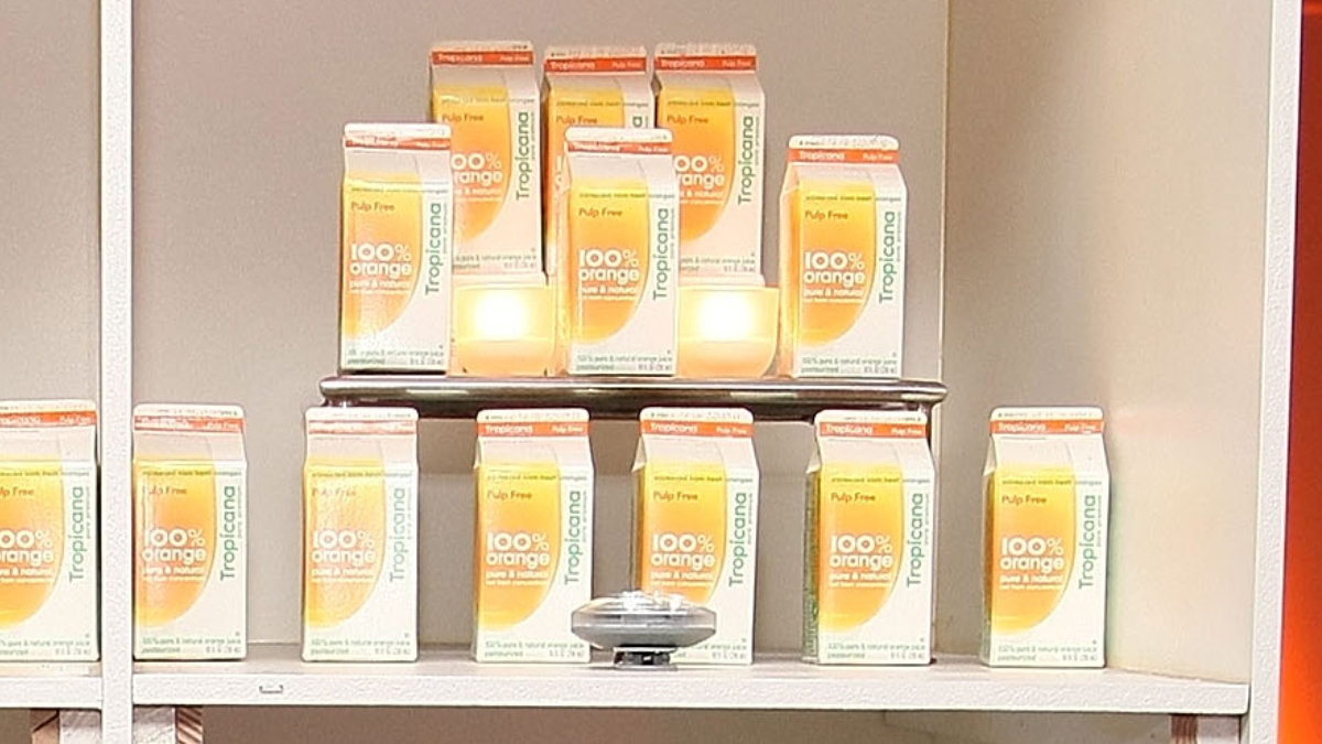
Tropicana was acquired by PepsiCo in 1998, and a decade later, the company made a huge blunder. In 2009, it replaced the existing packaging of the orange juice with a new design for its North American products.
The revamped carton featured a large glass of orange juice instead of the traditional orange with a striped straw poking out of its peel. The Tropicana logo also moved to the edge of the carton and was changed to a simpler font.
Customers reportedly rejected the new design in large numbers, prompting the company to return Tropicana to its original packaging.
GAP
The clothing company launched in 1969, but the logo you see at stores today wasn’t created until the early ‘90s. Then, in 2010, Gap went in a completely new direction, catching everyone by surprise.
The logo’s navy blue box was switched to a small blue square tucked away behind the “P.” The Gap name itself also became a basic font with only the “G” remaining capitalized.
Unsurprisingly, reactions were overwhelmingly negative and more than 14,000 parody versions popped up in just days. Gap Inc. took immediate action to correct the design blunder. On October 12, 2010, the GAP logo was back to its iconic blue square—just six days after the redesign was revealed.
IHOP

Though known as the International House of Pancakes, a 2018 menu addition led to both a name and logo change for the restaurant chain. Prior to the announcement that it would be selling burgers, the “P” in IHOP was flipped upside down, resulting in the new “IHOB.”
People were both puzzled and confused by the change, with many questioning whether it was a joke. The fake logo change was allegedly always meant to be temporary, but many critics were vocally opposed to the campaign.
Dan Hill, CEO of Hill Impact, told USA Today at the time that he “disliked the campaign due to how it misled customers and stakeholders alike into believing the company was changing its name.”
Even if the logo change did create enough buzz to boost burger sales, the company went back to being IHOP in July 2018, about a month after the original switch.
Other brands that returned to vintage logos
Many brands care deeply about what their customers want, even if any changes aren’t implemented immediately. Sometimes, companies will decide to redesign a logo to make it look similar to a vintage logo from the past. Usually, this is well received even when customers weren’t complaining about what was already in place.
Here are some brands that have made tweaks to their logos in recent years to return back to their roots:
- Burger King
- Baskin-Robbins
- Planters
- Volvo


